BLOG 8 – EP COVER (FIRST IDEAS)
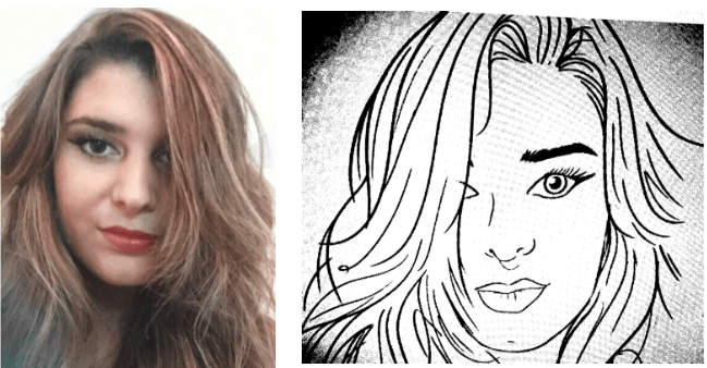
Now that me and Alex have gained an idea into what I am hoping to achieve for the Album cover, I will be working with him to create some drafts and previews. Below is a starting point where Alex has illustrated a photograph of myself (reference photograph on left) which I am extremely pleased with!
Figure 8.0. – First Preview
ELEMENTS – COLOUR & TYPOGRAPHY/TEXT FONT:
It is important to consider varying aspects/elements like colour when designing an album cover, and as Kipp (2018) states: ‘There are several elements that come into play for every album cover, from the colors and imagery used on the front cover to the typography and text on the back’. Kipp also considers to create something that relates to you as a person, and in this sense, I am hoping to incorporate some Greek designs.
Below is an interesting concept that Mehl (2013, p.158) suggests to use and states that ‘the relationship between music and color has been, and continues to be, an inspiration to musicians’. Dulux (n.d.) also suggests that mixing varying colours like dark or light can create ‘interest and a touch of energy’, which I hope to incorporate in some way.
Figure 8.1. – Colour Scale to twelve-note scale
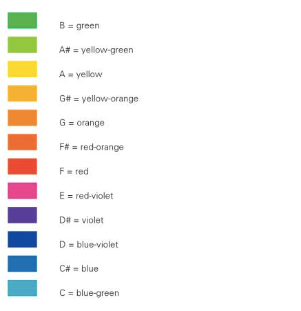
Source: Mehl, 2013, p.158
This could be something I could explore or experiment with in the sense of creating a song in a specific key, e.g. A major and create the cover to be in yellow as shown above. However, this will depend on the sort of sound I am hoping to achieve for the EP tracks and this may be difficult to interpret.
Figure 8.2. – Primary Colour Wheel
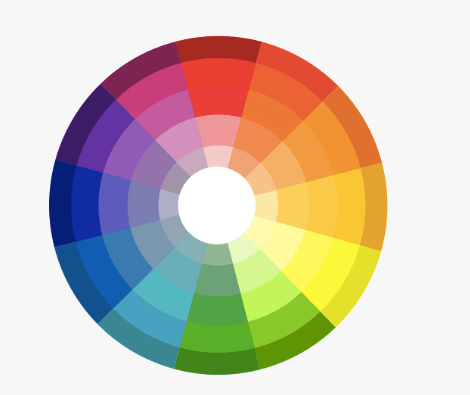
Source: Dulux, n.d.
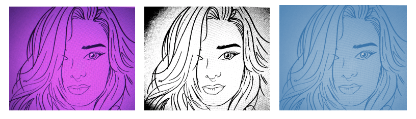
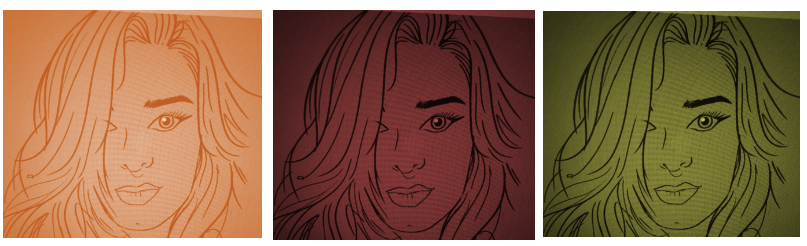
In order to consider what sort of colours work well with this illustration as a starting point, below are some primary colours that we have experimented with: purple, black and white, blue, orange, red and green. A variety of colours which have been taken from the wheel colour theory.
Figure 8.3. – Illustration Exploring Colours
FONT IDEAS:
In terms of font, we have also discussed how I would like my name to look. Below are a few examples that we have looked at as suggested by Alex. This will also need to be tested in the next preview of the cover.
Figure 8.4. – Fonts
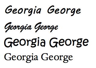
Figure 8.5. – Marina Album Covers (Love, Fear and Acoustic Version)
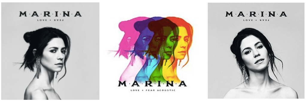
I have also looked at the artist Marina as a reference and inspiration for my cover who is also a British Greek singer and has incorporated a Greek style font on her recent album ‘Love and Fear’ (see figure 8.6.). The middle cover also demonstrates how she has used various colours for her acoustic album, demonstrating that several colours can work well together, rather than just one.
From this updated preview/session, I am extremely pleased so far with our collaboration! This gives me some form of hope that the final outcome will be achieved positively. Alex has also guided me through and has allowed me to gain a sense of what entails with being an artist.
What Next?
Now that Alex has been successful in illustrating a photograph of me as a starting point, the next steps are to:
- Choose the colour
- Decide on a font
- Further work on what I would like to be shown on the cover
Reference List:
Dulux. (n.d.). How to Use a Colour Wheel. Available at: https://www.dulux.com.au/how-to/how-to-use-colour/how-to-use-a-colour-wheel Accessed [May 2nd, 2020].
Kipp, M. (2018). How to design an album cover: the ultimate guide. Available at: https://99designs.co.uk/blog/design-other/how-to-design-album-cover/. Accessed [May 2nd, 2020].
Marina. (n.d.). Marina. The Official Website. Available at: http://www.marinaofficial.co.uk/ [Accessed May 2nd, 2020].
Mehl, R. (2013). Playing with Color: 50 Graphic Experiments for Exploring Color Design Principles. Rockport Publishers.
